
I don’t think I’ve ever written anything about pixel art and I hope this is gonna go ok. I don’t really consider myself a great pixel artist but I did get better over the last two years and this subject has been requested, so let’s do this!
Pixel art and low-res aesthetic are not oh-look-it’s-like-the-80s anymore. In fact the quality of pixel art we get these days looks particularly modern, with lots of different styles, cleaner, crunchier, more vibrant, more gloomy, lots of variations to the idea of working at the pixel level rather than using vectors at hi-res. And it takes time. Low-res sprites in particular can take an astonishing amount of time and patience to get good results. But there are tricks. There always are.
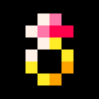
Today we’ll be making a ring sprite, starting with just the rough shape, as I usually do.

Let’s start with palettes! In pixel art, working with palettes is generally a good idea because color consistency is pretty and gives more interesting results. In Pico-8, we already have our 16-colors palette defined for us, but! 16 colors for 8×8 or maybe 16×16 sprites is way too much. You need to define sub-palettes of 3 or 4 colors.
The way I usually go about this is: I choose one, two or three bright colors I want in my sprite, these are the centers of my sub-sub-palettes. For each sub-sub-palettes, I add one or two colors that work as brighter versions of the central color and one or two colors that work as darker versions of that same central color. And while white is often gonna come back as one of the brighter color versions, you should try to avoid using black as a darker one. (or at all) Black has a high contrast with all the other colors and I generally save it for outlines or don’t use it at all. Use dark blue instead.
This palette construction can very easily be reproduced with code and that’s what’s happening here! The character sprites are being drawn with palette swaps based on palettes generated at start, with each time one main color and a darker version of it for the clothes.
If you want to read more about the Pico-8 palette and how to use it, the Doodle Insights #5 is all about that and you can access it there!
The reason you want lighter and darker tones of your main colors is that you want your sprites to be somewhat lighted and maybe even shiny! To do that, after drawing your sprite is plain colors, decide where the light source should be, make that consistent on all the sprites for your game/creation (for me it’s always top-left corner but you can get original), then imagine your sprite in 3D. Try to visualize which pixels are facing the light source (make them brighter) and which are hidden from it (make them darker).

This doodle is procgen rendering but the most interesting part of it was the lighting. The light source here is beyond the top-left corner. The two sub-palettes that can be used are {1,13,6,7} (=grey~silver) and {2,4,9,7} (=orange~bronze). The lighting is done through a clever trick that doesn’t have much to do with today’s subject. Point is: if an algorithm can do it, so can you!
Side-note here, you should always consider whether your sprite is going to be displayed in the background or in the foreground when choosing your colors and doing the spriting. I would recommend using predominantly darker colors and use only discreet lighting for background sprites. Same goes for decoration vs gameplay-related things. Your gameplay elements should be the most noticeable things in your game at all time, so make them brighter or maybe more complex. (but not too much)
Luckily, there other ways to make important sprites stand out!
Shadows can be created by drawing the pixels underlining your sprite with one color, generally darker. They are a good way to make your sprite stand out more but is especially good for UI stuff, as it gives that slick 3D effect that everyone loves. I also apply this effect to almost all of my pico-8 text by drawing it a first time with the shadow color and then a second time with the normal color just 1 pixel higher.
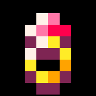
Outlines are done in a very similar way, coloring every empty pixel touching your sprite with one color, generally black or sometimes white. White outlines are a great way to highlight anything and black outlines are great to separate foreground elements from background ones. Outlines are also great for UI, sometimes I even go as far as having two outlines, a first one black and then a white one. And then a grey shadow. (And then one more optional black outline)
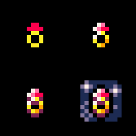
Both shadow and outline effect can be done by swapping every color to the color you want and then drawing your sprites with different offsets, using the camera function. Here’s some code!
-- calling with no parameters resets it
function all_colors_to(c)
 if c then
  for i=0,15 do
   pal(i,c)
  end
 else
  for i=0,15 do
   pal(i,i)
  end
 end
end

-- 'draw' must be a function callback
-- 'c' defaults to 0 if not set
-- 'arg' will be given to the draw function (optional)
function draw_outline(draw,c,arg)
 local c=c or 0
 all_colors_to(c)

 camera(-1,0) draw(arg)
 camera(1,0)  draw(arg)
 camera(0,-1) draw(arg)
 camera(0,1)  draw(arg)

 camera(0,0)
 all_colors_to()
end
To use this, you’ll need to create a function that draws something and then call draw_outline(yourfunction). This will only draw the outline and you’ll have to call your function again. (or just modify the draw_outline() function)

Until now we’ve only seen still sprites but you may want to do animations as well. Animations can be much superior to still sprites, just because your eyes like things that move. To me there are three categories of animation: character animation, object animation and effects. One word to make all of them good though: fluidity.

I like to make my characters dance, especially when idle, just because it’s fun to watch. In fact, I like this character style so much that I built an animation editor just for making them and you can try it out, it’s call Tiny Animator! Since I made it, I use it for every humanoid character that I make. It’s great for making expressive (/dancing) animations! Tiny Animator features what’s called onion skin, displaying the previous frame in a discreet way, behind the frame being edited. This is super useful to see what pixels you’re moving and ultimately makes the animation noticeably smoother.
I animate objects directly in Pico-8’s sprite editor but I don’t really do it a lot so I’m just gonna link you to someone who has a whole series of tutorials about animating pixel art and you’ll find a bunch of stuff about different types of objects! It’s Pedro Medeiros!
Again though, at low-res you need to keep track of what pixels are moving from one frame to the other. In this next doodle, every (big) pixel moves only by one at each frame.

We’ll see effect animation in another Doodle Insights because I have a lot more stuff to say about them!
Tilesets are also gonna be for another time I fear, but the previous rules about sub-palettes and lighting apply. Try to use rather dark colors and make a lot of variations for recurring tiles.(cracks, grass, flowers, dirt, rocks, etc) Animating tilesets is possible and here’s an example of what it can look like:

Obviously, the problem with that is that it might end up a bit distracting from gameplay.
Finally, I want to write a few words about how to get good at pixel art: Look at other people stuff, take what you like from it and try to reproduce it, iterate, iterate, iterate.
My pixel art comes from Orteil‘s stuff, Paul Veer‘s Nuclear Throne spritework, Hopoo’s Risk of Rain, many others and also all the pixel art I see on Twitter every day. Trying to come up with your own style right away is probably not the best way to go about it. You’ll find your style with iterations and you’ll improve it with more iterations!
To make good low-rez sprites, you need to define your shapes first, then lighten them, maybe add shadows and outlines to them and if you choose to animate them, make it smooth! Take inspiration where you find it, it’s ok to copy people’s styles as long as you copy multiple styles at the same time!
I hope you liked this doodle insights! It felt a bit unusual, it being all about pixel-arting but maybe that’s a good thing? Do tell me if you think I should do more like this!
Remarks and questions go on the Patreon post as usual! Especially if you need further explanation about anything, I’ll do that there. 🙂
These Doodle Insights are here thanks to the awesome people supporting it on Patreon! Here are their names!
Joseph White, Adam M. Smith, Ryan Malm, Matthew, Tim and Alexandra, Sasha Bilton, berkfrei, Nick Hughes, Christopher Mayfield, Jearl, Dave Hoffman, Thomas Wright, Morgan Jensen, Zach Bracken, Anne Le Clech, Flo Devaux, Emerson Smith, Cathal O’Keeffe, Dan Sanderson, Andrew Reist, vaporstack, Dzozef, Cole Smith, Jared Butowsky, Tony Sarkees and Justin TerAvest!
Thank you for reading, have fun with low-res pixel art!
TRASEVOL_DOG

Leave a comment