Today we are taking a look at the Pico-8 palette and how to make good use of it!
First off, here are the 16 colors composing the Pico-8 palette:
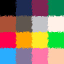
As you can see, the first 6 (0-5) are dark colors, the 7th and the 8th (6-7) are grey and white, and the last 8 (8-15) are brighter colors in a rainbow order.
To me, what is magic about this palette is that you can produce so many different effects with these colors. You can only use half of them to do beautiful gradients and have very homogeneous visuals, but you can also cut the palette into smaller 2-3 colors palettes for individual elements.
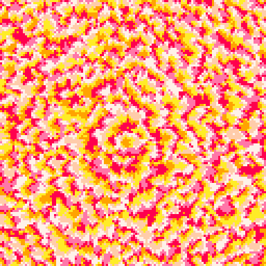
Here is an example of the first case with this lighting demo. Here I used barely half of the pico-8 palette as different shades of light.

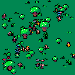
And here is an example of the second case, where dirt, vegetation, water, lava and different ores each have their own sub-palette.

Something that you should realize is that you don’t have to use the whole palette for your creations, especially since the 16 colors are very rarely applicable together in one scene.
Most of the time you’re gonna want to decompose the Pico-8 palette in different gradients. Sometimes you will want only one like in the light example above. But in most cases you will want at least two, for different elements. Best example is if you want to have friendly and enemy units, maybe you’ll want the friendly units to use a green sub-palette, and for the enemies, a red sub-palette. The easy option for that green palette would be dark green (3), green (11) and white (7). But if you try playing around with different colors, maybe you’ll find that yellow (10) can be added to this sub-palette or maybe blue (12) depending on the effect you want to give off.
Defining sub-pallettes is important for staying consistent in drawing objects of the same type. But the best way to make your sub-palettes richer is to experiment with them and trying to add colors to them, in different amounts.
Here is a flower generator that uses procedurally generated palettes, based on user-defined palettes fed to it:

The simplest type of sub-palette is just one color and its darker counterpart. I have mentioned this in the previous Doodle Insights but each color in the Pico-8 palette has a darker counterpart. Some of the colors even have several darker counterparts possible. Here is the array I generally use to define those darker counterparts:
drk={[0]=0,0,1,1,2,1,5,6,2,4,9,3,1,1,2,5}
This way I can just go ‘dark_color=drk[color]‘. And because it’s that easy, you can use it to make pretty much anything look better. This next example would look very bland if not for that little trick.

Of course you can also use it on small individual objects like here:

Here’s another ‘drk’ array that is also valid:
drk={[0]=0,0,1,1,1,1,13,6,2,4,4,3,1,2,2,14}
This can also be done the other way around for lighter counterparts, although you might encounter a problem. Because in my first ‘drk’ array, both blue and violet link to dark blue, so then, what should be the lighter counterpart of the dark blue, blue or violet? Same goes for almost each of the other darker colors. I don’t have a solution for this problem but surely you could have your way by using multiple arrays and setting more conditions for each color.
And maybe you don’t need the lighter counterparts for all of the colors. Here’s a neat trick: white (7) is a good counterpart for all of the bright colors (8+). And if you do choose to use all 8 of the brighter colors at once and mix some white in, welcome to Candy Land!

And of course, while white goes with each of the brighter colors, black on the other hand goes well with each of the darker colors.
Something you shouldn’t do when defining your palettes is putting together two colors that really don’t go together. Some of the colors in the Pico-8 palette will hurt your eyes if you put them in the wrong order. I’m thinking red and green, blue and yellow, dark green and beige… Those combinaisons should be forbidden. The solution there is either to make some sort of gradient between the two colors, or simply to choose a different combinaison of colors. But there is a third way.
Outlines! Outlines are great! So are shadows but I’m gonna write about outlines here because I like them better. I you want your objects to stand out, give them an outline! If what’s behind your objects is rather bright, make the outline black, if it’s really dark, make the outline white. Remember, those are the two colors that go with pretty much any other color. Thanks to the outline, you can have some green 2 pixels away from some red, as long as there’s some black between the two! But it’s especially great when you don’t want things to blend in with each other. In this next example, the small characters are procedurally generated and have many different color combinations possible. To avoid having them produce some sort of pixel monstrosity when being too close, I used outlines!
Finally, I’d like to point you towards the palette swapping guide that I made about a month ago. And also write again that the Pico-8 ‘pal()’ function is great and has two modes! ‘pal(ca,cb)’ will swap the color ca for the color cb each time you draw something but ‘pal(ca,cb,1)’ will do it for the whole screen at the end of the frame. That means you can have two layers of palette swapping, which is notably great for fade effects!
In conclusion! The Pico-8 palette is great because you can decompose it however you want and I encourage you to do that. I also encourage you to form tiny gradients as sub-palettes and to experiment with modifying those gradients. I do not encourage you to use the whole palette for your creations. White and black are the magic colors that go with everything. Outlines are great. Palette swaps are great.
That is it for this Doodle Insights #5! I hope you enjoyed it!
If you have any questions or remarks, please do share them on the Patreon post!
Some of the doodles presented here can be downloaded for free on itch.io and played directly on the Pico-8 BBS! The others (#46+) can be downloaded by patrons of the ‘Pico-8 Lover’ tier on the Patreon!
These Doodle Insights are here thanks to the awesome people supporting it on Patreon! Here are their names!
Joseph White, Adam M. Smith, Matthew, Tim and Alexandra, berkfrei, Nick Hughes, Christopher Mayfield, Jearl, Dave Hoffman, Thomas Wright, Morgan Jensen, Zach Bracken, Anne Le Clech, Flo Devaux, Emerson Smith, vaporstack, Dzozef, Cole Smith, Jared Butowsky, Tony Sarkees and Justin TerAvest!
Next week I will probably do a first part about procedural generation. I’ve reconsidered the amount of things I have to say about that subject and I think there’s enough to do a lot of parts so I’m probably gonna do semi-independent articles about smaller subjects relevant to procgen.
Have fun with the Pico-8 palette!
TRASEVOL_DOG
